Automagically Run Your Photography Business
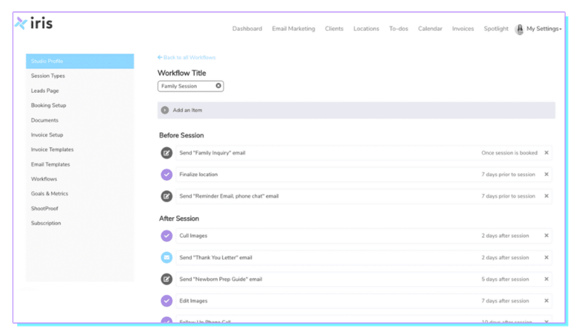
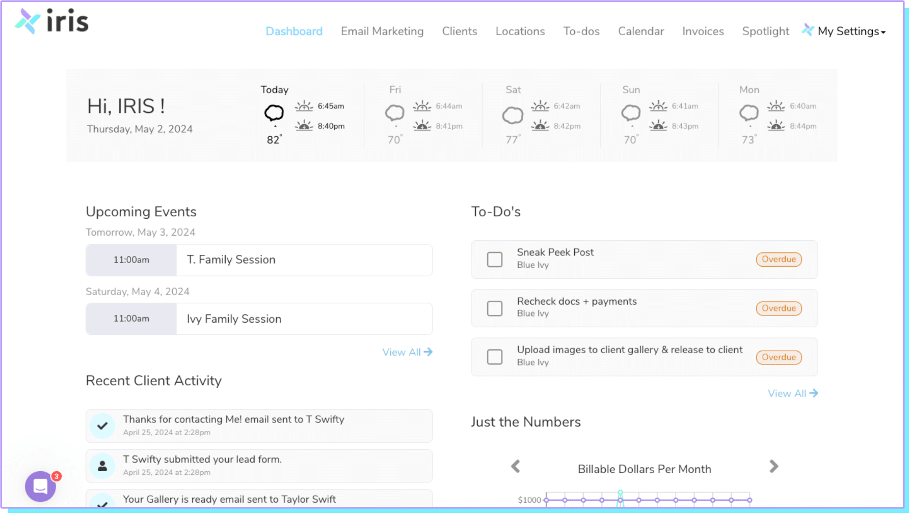
From scheduling and client management to automated invoicing and email marketing, Iris Works is a CRM designed to streamline your entire workflow.
Already have an account? Log in now
Keep Your Focus on Photography, Not Admin
We’ve worked with thousands of photographers and understand the biggest obstacles standing in your way:
Overwhelming workload
Balancing shoots and administrative tasks is a constant struggle.
Missed opportunities
Potential clients slip through the cracks due to disorganized systems.
Unpredictable cash flow
Delayed invoicing and payment chasing create financial stress.
Inconsistent communication
Difficulty managing client interactions leads to dissatisfaction.
Streamline with Iris Works
An up-leveled photography business is closer than you think.
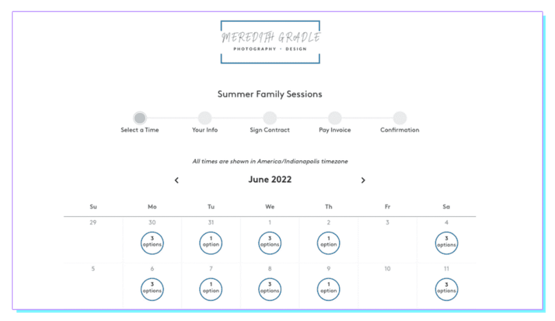
Effortless Scheduling
Manage all your appointments, shoots, and events in one place, reducing the risk of conflicts and maximizing productivity.
Seamless Client Management
Keep track of client information, communication history, and project details effortlessly.
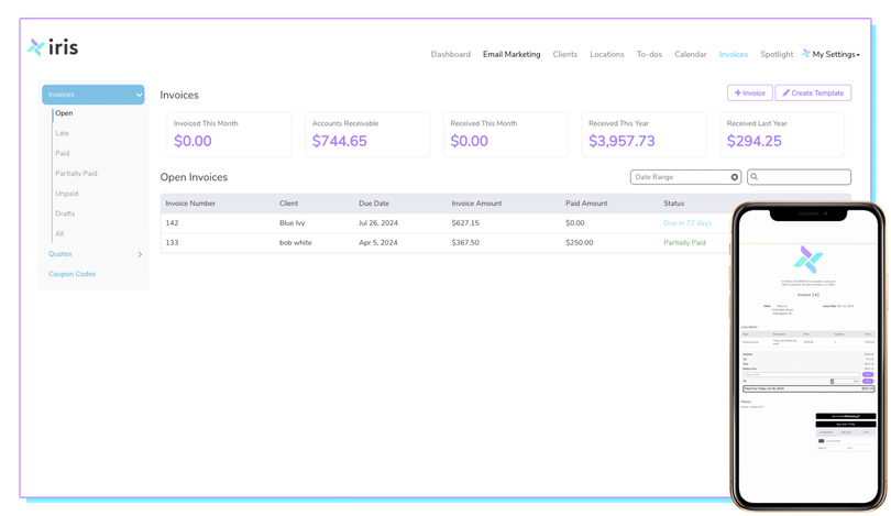
Automated Invoicing
Send invoices automatically and track payments to maintain a healthy cash flow.
Effective Marketing
Implement automated email campaigns to engage clients and generate repeat business.

We understand your challenges
As professional photographers ourselves, we’ve faced the unique challenges of running a photography business. Partnering with thousands of photographers has deepened our understanding, and we’ve designed Iris Works to address these pain points directly, providing a seamless and efficient solution tailored specifically for photographers.
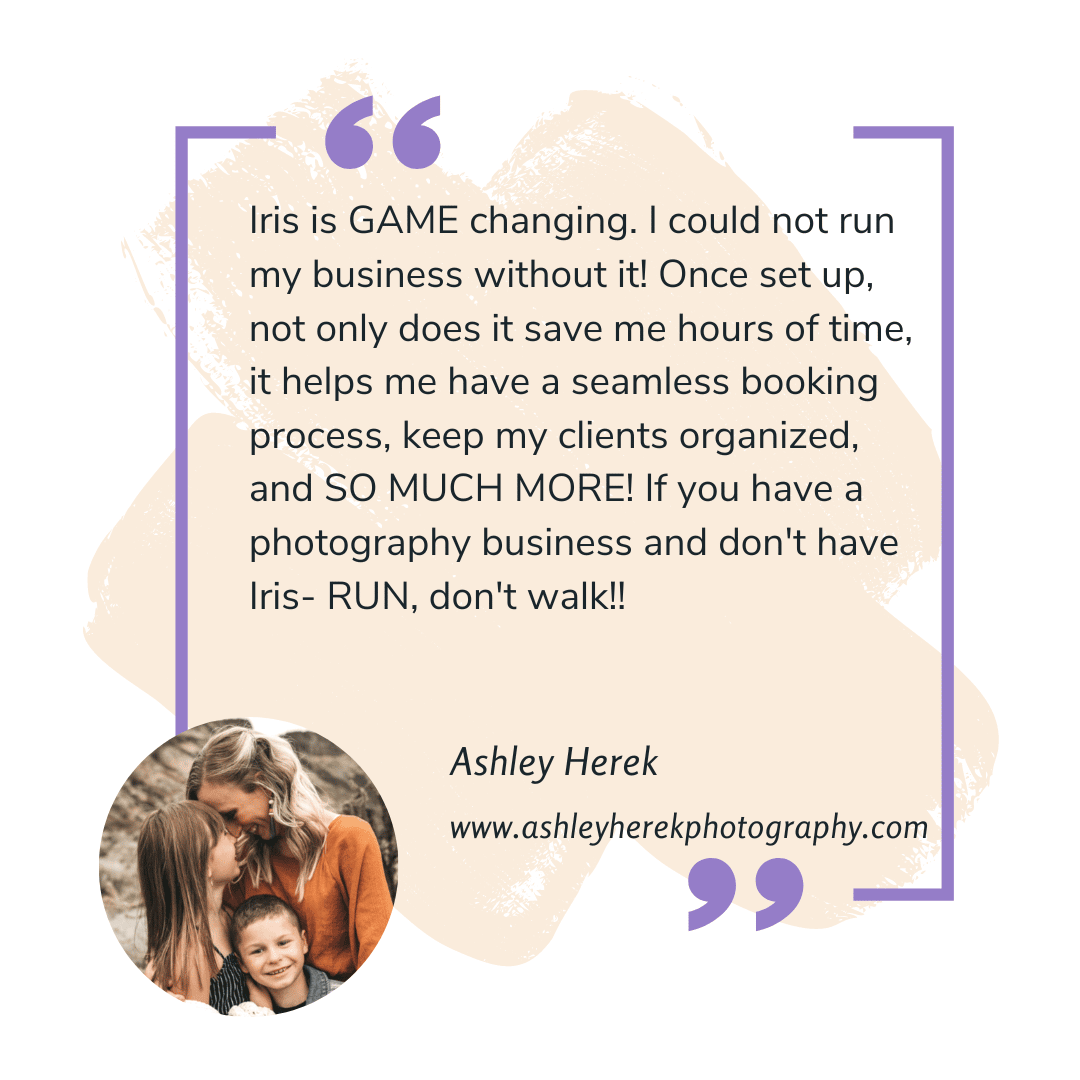
Trusted by photographers worldwide
Join the community of photographers who have transformed their businesses with Iris Works.
Getting started is easy
ONE
Sign up
Create your free account and begin your trial.
No credit card needed
TWO
Set up
Customize your dashboard and import your data.
Coming from another platform?
THREE
Streamline
Get back to doing what you love and let Iris work its magic.
New Paragraph
Pricing for every budget
Join the community of photographers who have transformed their businesses with Iris Works.
$29.95/month
Basic
or $299/year
Plan includes:
- Workflows and Automation
- Custom Integrated Lead Page
- E-Contracts and Free Templates
- Invoices and Quotes
- Locations
$39.95/month
Pro
or $399/year
Everything in Basic plus:
- Online Booking OR Email Marketing
- Workflows and Automation
- Custom Integrated Lead Page
- E-Contracts and Free Templates
- Invoices and Quotes
- Locations
- Free Account Setup
$49.95/month
Pro Plus
or $499/year
Plan includes:
- Online Booking
- Email Marketing
- Workflows and Automation
- Custom Integrated Lead Page
- E-Contracts and Free Templates
- Invoices and Quotes
- Locations
- Free Account Setup

Turning a problem into a solution
I created Iris because existing solutions were too complex for photographers. My disorganized process led to missed invoicing and unhappy clients. After a major miscommunication with a repeat client, I realized I needed a better system. I found that most options were not suited for creative minds, so I decided to create Iris. It’s a simple, straightforward CRM designed to organize and automate your photography business. Try Iris Works and see how it can transform your workflow.
Meredith Gradle, Founder

